# Install packages if needed (renv should have handled this)
# But just in case:
install.packages(c("tidyverse", "broom", "knitr", "patchwork"))Constructing a reproducible blog post using zzcollab tools
r
zzcollab-compendia
reproducibility
I didn’t really know much about [topic] until I tried to [implement/understand] it myself. Here’s what I learned along the way.
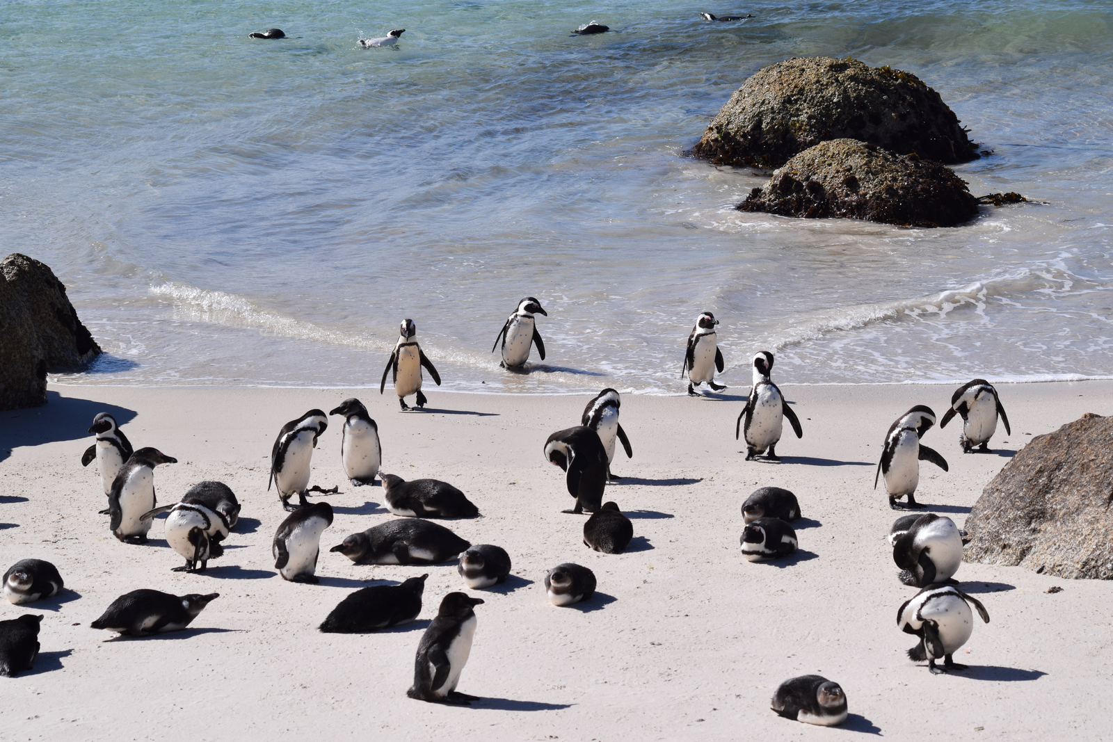
Photo caption with attribution if needed. This image sets the visual tone for your entire post.
1 Introduction
I didn’t really know much about [topic] until I [encountered situation/tried to implement it/needed it for project]. Like many data scientists, I thought [initial misconception or assumption]. Turns out, [what you actually discovered].
[Brief context: Why did you need this? What problem were you trying to solve? Keep it personal and specific.]
Here’s what I set out to understand:
1.1 Motivations
Why explore [topic]? - [Personal reason 1: specific problem you faced] - [Practical need 2: gap in your workflow] - [Learning goal 3: skill you wanted to develop] - [Curiosity 4: interesting question you had]
1.2 Objectives
What I wanted to accomplish: 1. [Specific, measurable objective 1] 2. [Specific, measurable objective 2] 3. [Specific, measurable objective 3] 4. [Stretch goal or advanced concept]
Disclaimer: This learning process is documented here. Errors spotted or better approaches are always welcome.
2 Prerequisites and Setup
The following are needed to follow along:
# Load libraries
library(tidyverse)
library(broom)
library(knitr)
library(patchwork)
source("R/plotting_utils.R")  # Load custom utility functions

# Setup theme and colors
setup_plot_theme()
colors <- get_analysis_colors()

# Load PREPARED data (generated by 01_prepare_data.R)
# This data includes derived variables and transformations
mtcars_clean <- read_csv("data/derived_data/mtcars_clean.csv", show_col_types = FALSE)
Background: Basic R and ggplot2 familiarity is helpful but not required. Concepts are explained as we proceed.
3 What is [Topic/Concept]?
Before examining the code, it is worth clarifying what [topic] actually means. [Simple, plain-language explanation of the concept. Use an analogy if helpful.] In practice, this means [concrete example or application].
4 Getting Started: Initial Exploration
# Display structure of prepared data
glimpse(mtcars_clean)
We have 32 cars with 11 variables. We now examine the data characteristics.
# Key summary stats
summary_table <- mtcars_clean %>%
  summarise(
    n = n(),
    mpg_mean = round(mean(mpg), 1),
    mpg_sd = round(sd(mpg), 1),
    hp_mean = round(mean(hp), 0),
    hp_sd = round(sd(hp), 0)
  )

kable(summary_table,
      col.names = c("N", "MPG Mean", "MPG SD", "HP Mean", "HP SD"),
      caption = "Summary Statistics: Motor Trend Car Data")
Average fuel efficiency is 20.1 MPG with considerable variation (SD = 6.0).
5 Exploring the Data
We visualise these patterns using pre-generated figures from analysis/scripts/03_generate_figures.R:
knitr::include_graphics("figures/eda-overview.png")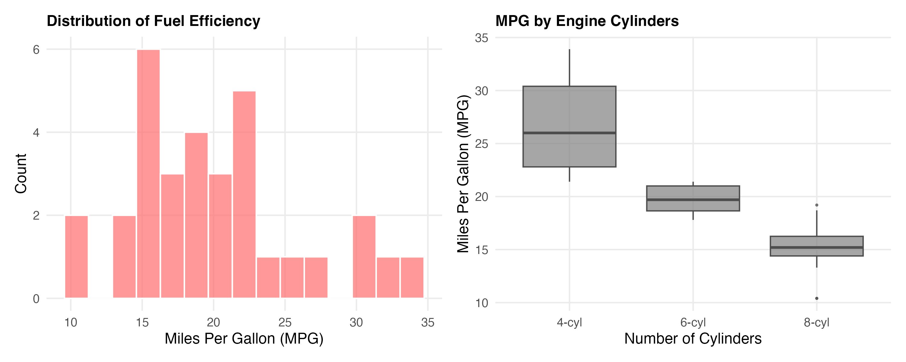
Cars with fewer cylinders are consistently more fuel-efficient.
5.1 Looking for Relationships
# Find strongest correlations with MPG
correlations <- cor(mtcars_clean %>% select(where(is.numeric))) %>%
  as.data.frame() %>%
  rownames_to_column("var1") %>%
  pivot_longer(-var1, names_to = "var2", values_to = "correlation") %>%
  filter(var1 == "mpg", var2 != "mpg") %>%
  arrange(desc(abs(correlation)))

# Display top 5
kable(correlations %>% head(5),
      caption = "Top 5 Correlations with MPG (fuel efficiency)")
Weight has the strongest correlation with MPG (r = -0.87). We visualise that relationship:
knitr::include_graphics("figures/correlation-plot.png")
Heavier cars consistently get worse mileage, a relationship consistent with basic mechanics.
6 Building a Model
We fit a simple linear model to quantify this relationship:
# Load pre-computed model results from 02_fit_models.R
model_coef <- read_csv("data/derived_data/model_coefficients.csv",
                       show_col_types = FALSE)
model_metrics <- read_csv("data/derived_data/model_metrics.csv",
                         show_col_types = FALSE)
# Display model coefficients
kable(model_coef %>% select(term, estimate, std.error, p.value, conf.low, conf.high),
digits = 4,
caption = "Linear Regression Results: MPG ~ Weight")# Display fit metrics
kable(model_metrics %>% select(r.squared, adj.r.squared, statistic, p.value, df.residual),
digits = 4,
caption = "Model Fit Metrics")The model explains 75% of the variance (R² = 0.75). This is a reasonably strong fit. For every 1,000 lbs of weight, fuel efficiency decreases by about 5.3 MPG (95% CI: [-6.5, -4.1]).
knitr::include_graphics("figures/model-plot.png")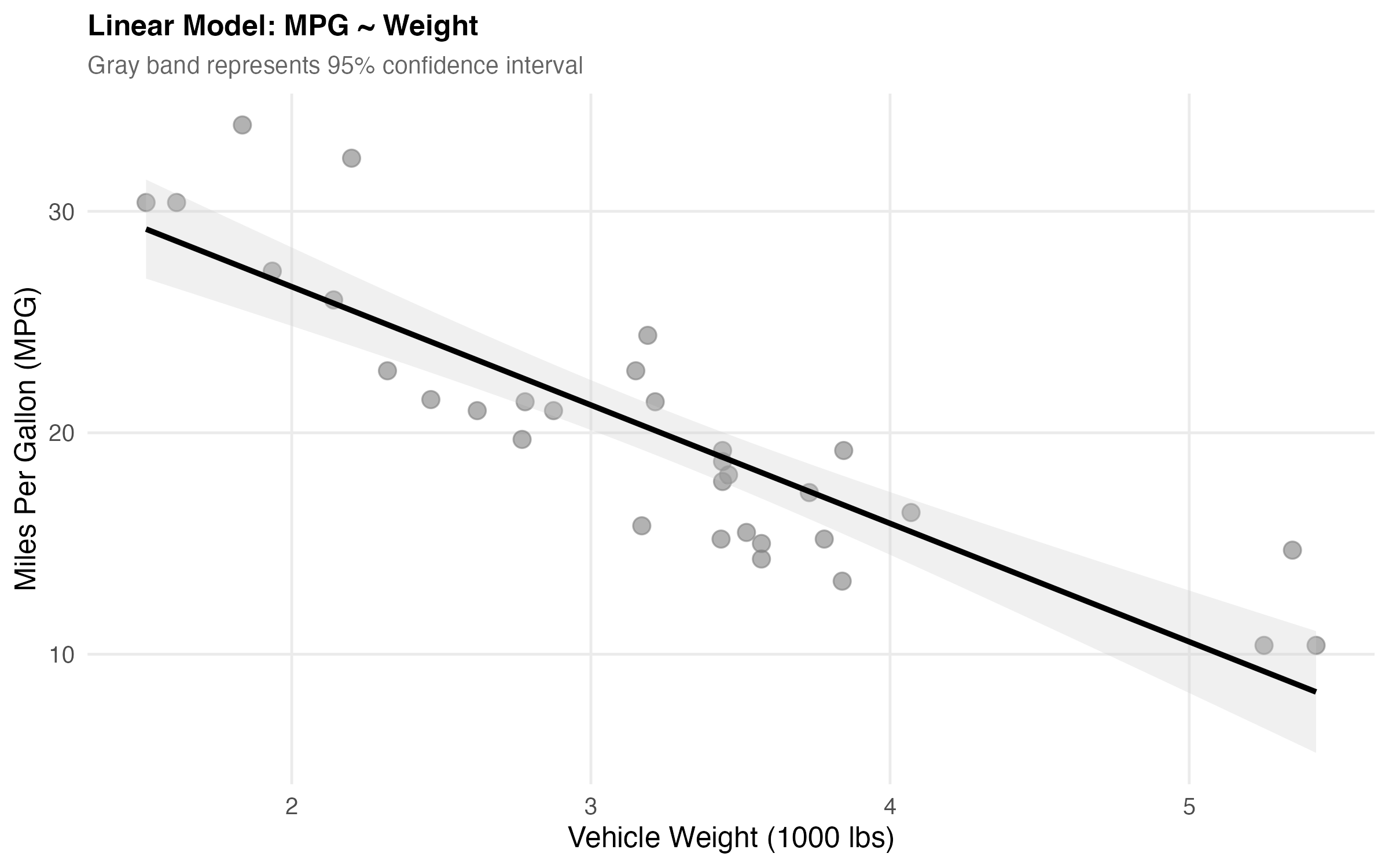
6.1 Making Predictions
We make predictions to illustrate the model in practice:
# Predict MPG for different weights
new_data <- tibble(wt = c(2, 3, 4))
model <- readRDS("data/derived_data/simple_model.rds")
predictions <- predict(model, newdata = new_data, interval = "confidence")

cbind(new_data, predictions) %>%
  kable(digits = 2,
        caption = "Predicted MPG for Vehicles of Different Weights")
A 2,000 lb car yields approximately 30 MPG, while a 4,000 lb car yields only approximately 15 MPG.
7 Checking Our Work
Before trusting these results, we check model assumptions:
# Load pre-computed diagnostics
diagnostics <- read_csv("data/derived_data/model_diagnostics.csv",
                       show_col_types = FALSE)

# Summary
outlier_count <- sum(diagnostics$is_outlier)
cat("Outliers found (>2.5 SD):", outlier_count, "\n")
cat("Residual SE:", round(sqrt(mean(diagnostics$residuals^2)), 2), "MPG\n")
Diagnostic checks: Two to three potential outliers (>2.5 SD) were found. These merit investigation but do not substantially affect the overall model fit.
Now let’s visualize the residuals to check for patterns:
knitr::include_graphics("figures/diagnostics-plot.png")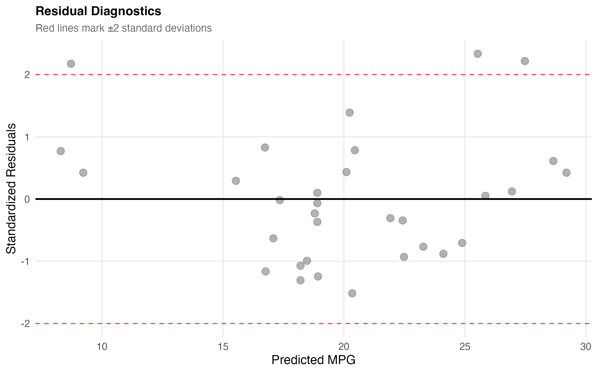
No major patterns appear in the residuals, though a couple of potential outliers warrant investigation.
7.1 Things to Watch Out For
A few gotchas encountered while working on this:
Do not extrapolate too far - This model is valid for weights between 1.5-5.5 thousand lbs. Predicting outside that range is unreliable.
Correlation is not causation - Weight correlates with MPG, but there are confounding variables (engine size, aerodynamics, etc.).
Check model assumptions - Always plot residuals. A high R² does not guarantee the model is appropriate.
Small sample size - With only 32 cars, confidence intervals deserve careful attention.
8 What Did We Learn?
8.1 Lessons Learnt
The main takeaways from this exploration:
Conceptual Understanding: - Vehicle weight is a strong predictor of fuel efficiency (R² = 0.75) - Each 1,000 lbs reduces MPG by ~5.3 miles (95% CI: [-6.5, -4.1]) - Cylinder count effects are partially mediated through weight - Simple models can be surprisingly effective with the right predictor
Technical Skills: - Using broom::tidy() for clean model output formatting - Calculating and interpreting confidence intervals for predictions - Creating diagnostic plots to validate regression assumptions - Combining multiple ggplot visualizations with patchwork
Gotchas and Pitfalls: - Always check residual plots - R² alone isn’t enough! - Extrapolation beyond data range is dangerous - Small sample sizes (n=32) require cautious interpretation - Correlation doesn’t prove causation (confounding variables matter)
8.2 Limitations
This analysis has several limitations:
- Old data: mtcars is from 1974 - modern vehicles (hybrids, EVs) behave differently
- Small sample: Only 32 observations limits statistical power
- Missing variables: Doesn’t account for aerodynamics, transmission type, engine tech
- Simple model: Single predictor ignores important confounders
- Limited scope: Only passenger cars; may not generalize to trucks/SUVs
8.3 Opportunities for Improvement
If additional time were available, the following would be worth exploring:
- Multiple regression - Add cylinder count, horsepower, transmission type
- Interaction effects - Does weight impact differ by number of cylinders?
- Modern data - Replicate with 2020+ vehicle data to see how relationships changed
- Non-linear models - Try polynomial regression or splines for better fit
- Machine learning comparison - How does linear regression compare to random forest?
- Causal inference - Use techniques to establish causality, not just correlation
9 Wrapping Up
This exploration confirms that vehicle weight is a powerful predictor of fuel efficiency, accounting for 75% of the variance. The model is simple but effective, though the limitations noted above apply.
Working through this analysis clarified [specific technical skill you gained]. Additional extensions (more predictors, non-linear models, modern data) would all be instructive next steps.
For those attempting this themselves: - Begin with exploration before modelling. - Plot residuals before trusting the fit. - High R² alone does not validate a model. - Report confidence intervals alongside point estimates.
10 See Also
Related posts and resources:
- [Link to related post 1]
- [Link to related post 2]
- [Link to related resource]
Key Resources: - R for Data Science - Free book on tidyverse - Introduction to Statistical Learning - Free textbook with R code - broom package docs - Tidy model outputs - Cross Validated - Stats Q&A community
11 Reproducibility
Data: mtcars (built-in R dataset, loaded by analysis/scripts/01_prepare_data.R)
Analysis Pipeline:
make docker-build
make docker-post-render
Or step-by-step:
Rscript analysis/scripts/01_prepare_data.R
Rscript analysis/scripts/02_fit_models.R
Rscript analysis/scripts/03_generate_figures.R
quarto render index.qmd
All Reproducible Code: - analysis/scripts/01_prepare_data.R - Data preparation - analysis/scripts/02_fit_models.R - Model fitting - analysis/scripts/03_generate_figures.R - Figure generation - R/plotting_utils.R - Reusable utility functions - analysis/report/index.qmd - This blog post (narrative only)
Session Information:
R version 4.5.3 (2026-03-11)
Platform: aarch64-apple-darwin25.3.0
Running under: macOS Tahoe 26.5

Matrix products: default
BLAS:   /opt/homebrew/Cellar/openblas/0.3.32/lib/libopenblasp-r0.3.32.dylib
LAPACK: /opt/homebrew/Cellar/r/4.5.3/lib/R/lib/libRlapack.dylib;  LAPACK version 3.12.1

locale:
[1] en_US.UTF-8/en_US.UTF-8/en_US.UTF-8/C/en_US.UTF-8/en_US.UTF-8

time zone: America/Los_Angeles
tzcode source: internal

attached base packages:
[1] stats     graphics  grDevices utils     datasets  methods   base

loaded via a namespace (and not attached):
 [1] htmlwidgets_1.6.4 compiler_4.5.3    fastmap_1.2.0     cli_3.6.6
 [5] tools_4.5.3       htmltools_0.5.8.1 parallel_4.5.3    yaml_2.3.10
 [9] rmarkdown_2.29    knitr_1.50        jsonlite_2.0.0    xfun_0.56
[13] digest_0.6.37     rlang_1.2.0       evaluate_1.0.5
thats all folks!12 Let’s Connect!
Questions, suggestions, or spotted errors are welcome.
- Twitter/X: @rgt47
- Mastodon: @your_mastodon
- GitHub: rgt47
- Email: Contact form
Please reach out for any of the following: - Errors or corrections spotted - Suggestions for improvement - Discussion of the approach - Questions about implementation - A simple hello